Critique of Library Websites
The philosopher Immanuel Kant pointed out in his famous Critique of Aesthetic Judgment that there is something about aesthetic judgments which compels us to demand that others agree with us—and blame them if they don’t. It is not without trepidation that I post my “critique of academic library websites,” featuring my top college library sites for 2014, which is inspired in part by one of my favorite philosophers.
Kant is also known for having inspired German Romanticism at the time of the Enlightenment, making room for more than just “reason” (Rationalism). In the spirit of Kant, I believe libraries should stop thinking of themselves merely as providers of information, and think of themselves as purveyors of a certain kind of very subjective user experience which goes beyond mere information to something grander, even “sublime” in the Kantian sense.
 Portrait of Immanuel Kant In this context, I believe that, as much as possible, library websites should do what they can to emphasize their collections and promote an activity which has often been underestimated in academic research libraries: browsing, or as I like to call it, serendipitous discovery. Luckily, the tools and technologies are now available to encourage a more immersive online library experience, even though average screen sizes have gotten much smaller. The libraries that have done it right this year have promoted browsing.
Also this year, there have been many libraries changing over to responsive and mobile-first designs in an effort to accommodate users who need to view the library’s website through hand-held devices. This trend, which emphasizes usability on a screen that is up to 1/10 the size of a traditional PC screen, has had a profound impact design standards and aesthetics. For one thing, it has forced designers to think strategically how to communicate visually, using pictures, symbols and icons, rather than with words, since words are hard to read on a small screen.
This poses unique challenges for libraries and other “information-driven” sites, whose content might not lend itself well to visual representation on a screen the size of a granola bar. In many instances, it has also forced libraries to prioritize, far more than they’d like to, which databases and services are going to be most prominent.
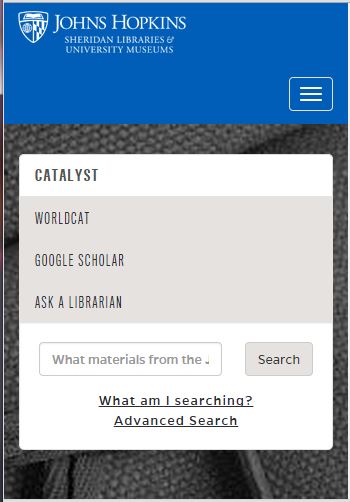
By 2015, something like this is what the library homepage may resemble for a good number of mobile users:

Despite the difficulties and compromises entailed adapting sites to a small screen, many libraries are in the process of redesigning their websites to make them more responsive, that is, better able to be viewed on a smart phone or tablet, and also more easily maintained through a content management system.
“Responsive design” and “content management” go hand-in-hand, because placing content into a CMS (a database) makes it possible for page content to reorganize itself dynamically for any sized screen or page orientation.
On the Sublime and the Functional: A Romantic Paradigm.
If we can believe what we see in movies, art and blog posts, there is still an expectation, or sentiment, among administrators, library users and nonusers, that libraries be aesthetically pleasing—even magical places, representing unlimited possibilities.

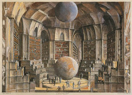
While not all libraries are large or beautiful, and not all have physical books—but the best ones do—I believe that the “infinite library” is still an apt metaphor for optimal user experience. To our best customers, libraries are places of personal exploration, of transcendence, inspiration and possibility.
In Kant’s aesthetic framework, this type of experience of boundless possibility can be categorized as “sublime.” How to facilitate this kind of rich experience though a user interface, and especially a smaller and smaller screen, is one of the many challenges libraries face.
Having surveyed the library home pages of, arguably, the most beautiful college libraries, from venerable ivy leagues to liberal arts colleges (and also those of the leading design schools, Rhode Island School of Design, Pratt Institute, Cooper-Hewitt Design Library, Cooper Union, NYU, UC Berkeley, the New School / Parsons School of Design, and numerous others), I have concluded that people are just not expecting all that much from academic library websites.
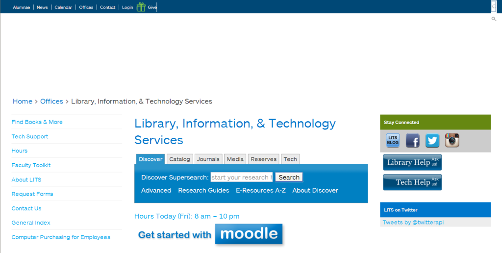
In fact, many academic library websites are generic and uninteresting, consisting of a tabbed or single search box with links to resource below it. Most have all the appeal of an online user manual, if even that. Academic library websites often fail to please because they:
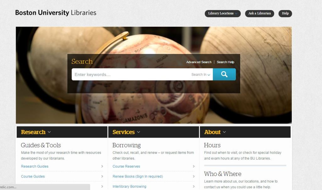
- Fail to cultivate a sense of excitement or wonder, or communicate a shared passion for books, publication, learning or discovery. Most fail to cultivate a humanistic or scholarly interest in the things contained in the library. So many library websites look like this these days, a big single search box and columns of links below it:

Think about it: would you want to buy from an online retailer who gave you just a search box to search the inventory, lists of links, and a text box to chat with staff? No, not unless you had to.
- No user engagement; no human interest: no personality, no “soul.” People give it soul. Give your library website a more personal touch.
People are naturally interested in what other people are doing and reading.
Pictures with people in them, user polls and surveys (with results posted), and even user online maps revealing how many people are online and doing what, are ways to facilitate increased audience engagement.
What are your faculty reading? Can you get them to recommend titles and showcase these on your home page?
- Only provide passive access to resources, but fail to promote awareness of resources in the first place.
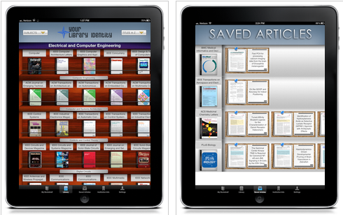
Encourage users to learn about new materials in your collections by browsing apps. Browsing apps are the new big thing in academic libraries—browsing is not just for public libraries anymore! Check out this flyer from Library Thing about their book display apps.

It is now also possible to browse scholarly journals through a graphical interface called BrowZine.

Browsing apps are so important that before choosing a platform (like WordPress or SharePoint) I would be inclined to consult with library vendors to see what browsing apps their apps plugin to.
Scrollers (rotating images) allow you to put a lot of content where users will see it, and conserve space on your home page. Unless you have a JavaSript programmer on your staff who can code this for you, make sure your site will support a range of scrollers of different sizes.
Make sure your site will allow you to place enough of your content where users will see it. Anything below “the fold” will probably not be seen. You cannot promote your library without being able to place content where users will see it.
- So generic that one library’s home page could just as well work for another.
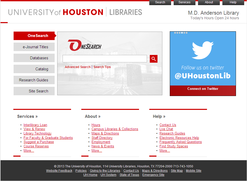
The University of Houston’s home page is functional, but it could really be ANY library’s homepage.

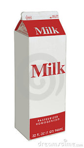
I suppose it might be argued that the site’s modern design goes with its modern campus in a modern city not known for its aesthetic appeal, but it is generic, impersonal and about as interesting as a carton of milk. 
- No sense of place. The library website fails to serve as a logical extension of the physical library.
For example, compare the beauty and atmosphere of the Learning Commons at Mount Holyoke College with the appearance of its website below it:
 
Here, there is no connection at all between the appearance of the library and the design of the website, although there are many visual elements and motifs that could have been incorporated into the site’s design.
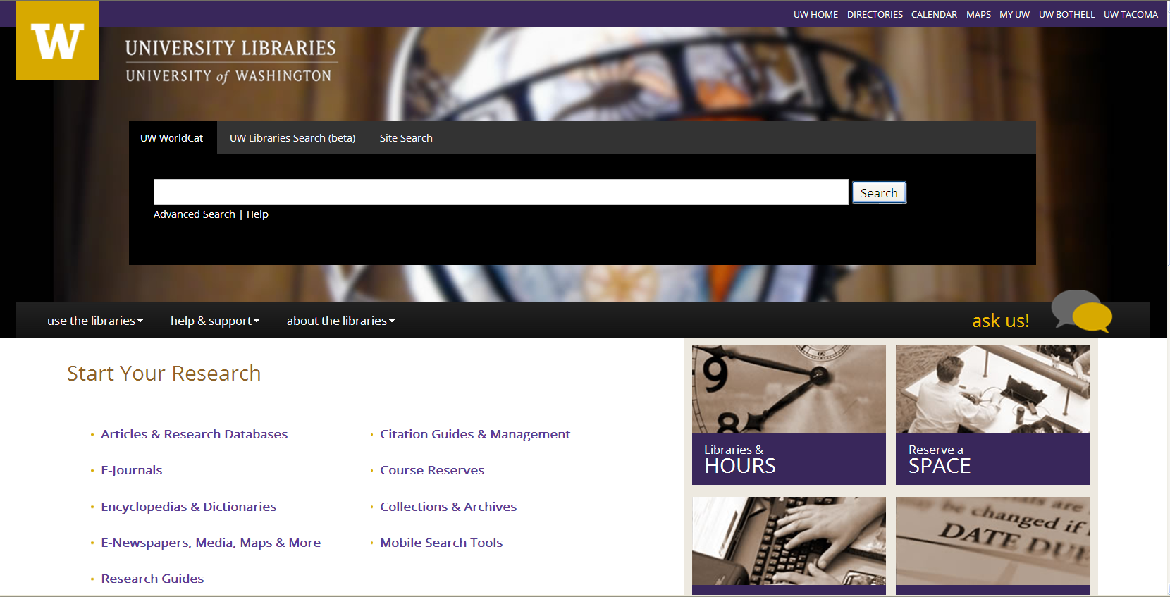
Even where the architecture of the library is gorgeous, as in the University of Washington’s Suzzallo Library,

this gorgeousness often does not translate well to the library’s website—though here, to their credit, they did adopt a rich purple and taupe scheme:

One reason why the University of Washington’s Library homepage is less effective than it could otherwise be for PC users is it employs a “mobile-first” responsive framework, which is why 50% of the page is an excessively large search box.
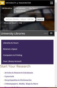
Here is what the same site looks like on a smart phone:

In all honest, it is very tricky to come up with a responsive site that looks really good on a PC screen. Some libraries have opted to offer a separate mobile version rather than trying to come up with a design that promises to look good on all sized screens.
More on the “Most Magical” Libraries List
Because I prefer more traditional libraries—wood, paper, leather, books—I thought I would begin by looking at the websites of the most aesthetically pleasing college libraries, thinking that they would have the most beautiful websites.
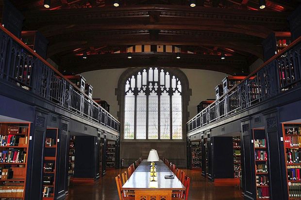
Both the University of Washington’s Suzzallo Library and Mt. Holyoke’s Learning Commons, above, were included in this list of Magical College Libraries (TakePart, February 5, 2014 Sarah Fuss).
Let’s compare a few more of these most magical libraries with their web pages to see if the magic comes through.
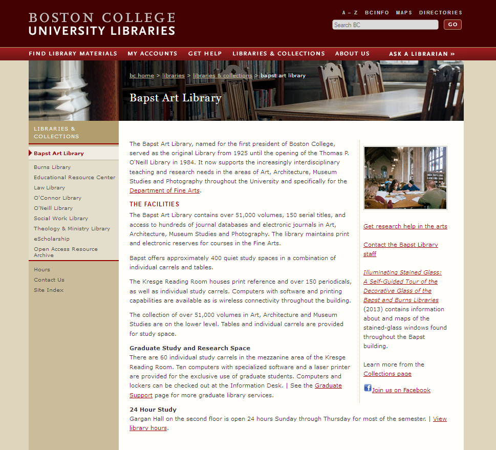
Bapst Art Library, Boston College


Too much descriptive information about the library makes this site boring, especially for an art library. You’d think they would offer more visual content.
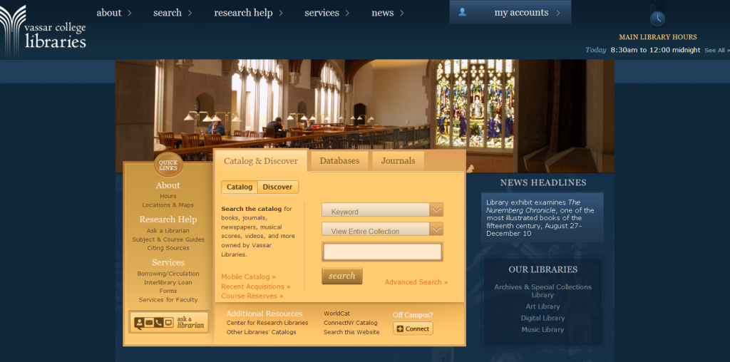
Vassar College Library

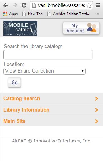
Actually, Vassar did a very nice job on their site because they incorporated elements of their architecture into it, giving it a sense of place. They made good use of screen space for PC users, offering a separate mobile version so they didn’t need to change the proportions or orientation for smaller screens.
Though it doesn’t compare to the beauty of the library, I think it’s pretty nice with a lot of attention to detail:
 Here is the mobile version: Here is the mobile version:

Vassar gets a “great job”.
George Peabody Library, Johns Hopkins University

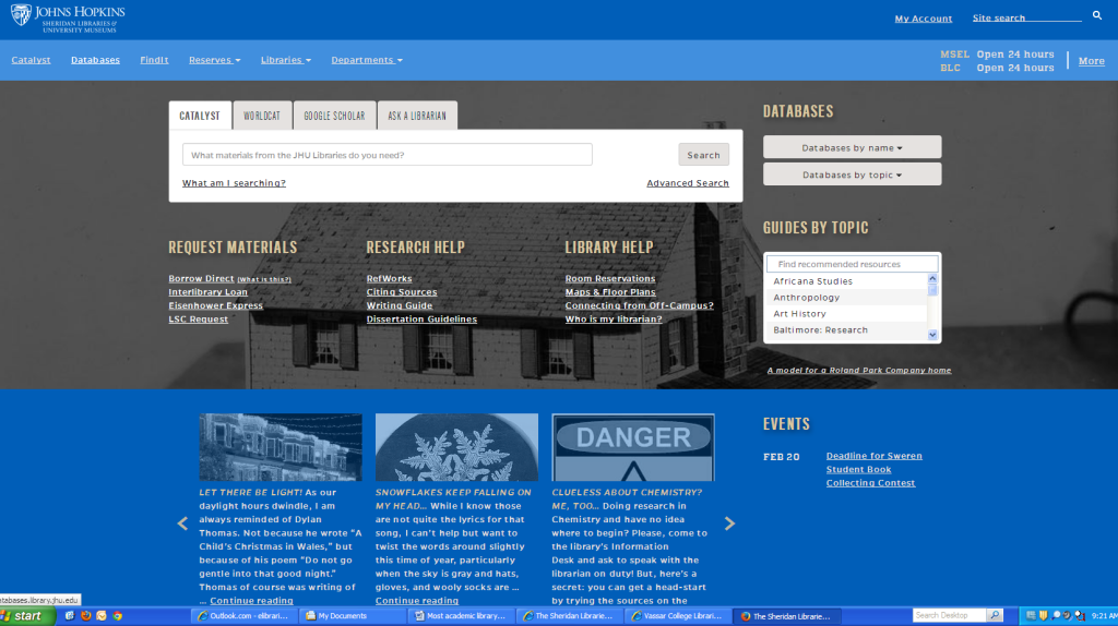
Here is Johns Hopkins University’s library homepage:

I appreciate the site’s layout, and especially the slider at the bottom of the page. JHU Library made good use of the screen space on a PC. But why the grey/blue color scheme that washes over everything? The colors and images are unappealing. Here is the landing page on a mobile device:

Now, if you must use school colors, and the school colors are ugly, just mix them up with other colors to come up with a richer color palette. (If you aren’t good with color, just get the hex values of your school colors and use free online palette creators /generators to come up with other colors that work well with the ones you have.)
As with Johns Hopkins, many of the so-called magical libraries on the Most Magical list are now the rare books library for the school, and some are even closed off to students, so they really don’t represent “the campus library anymore.” It’s only where fundraisers and private parties are held.
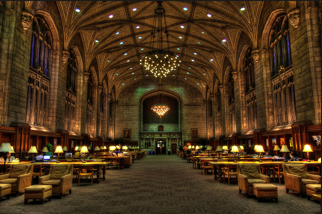
Another library on the Most Magical list, the University of Chicago’s Harper Library, also isn’t functioning as the university’s library anymore. In fact, the books that are there are merely ornamental. The space is now a study hall.

Interestingly, the University’s of Chicago’s newest library also lacks books—at least visible traces of them.
The University of Chicago’s latest library, serving both the sciences and humanities, is a glass dome with all the books stored in an underground bunker, retrieved by robotic cranes. This dehumanizing monstrosity is celebrated as award-winning from an architectural standpoint, a great mechanical wonder, but I wonder if patrons really enjoy their experience as much as they would a regular library with open stacks, more intimate spaces, books on display, newspapers and a little less sunshine.
 
You can see how it all works in this video.
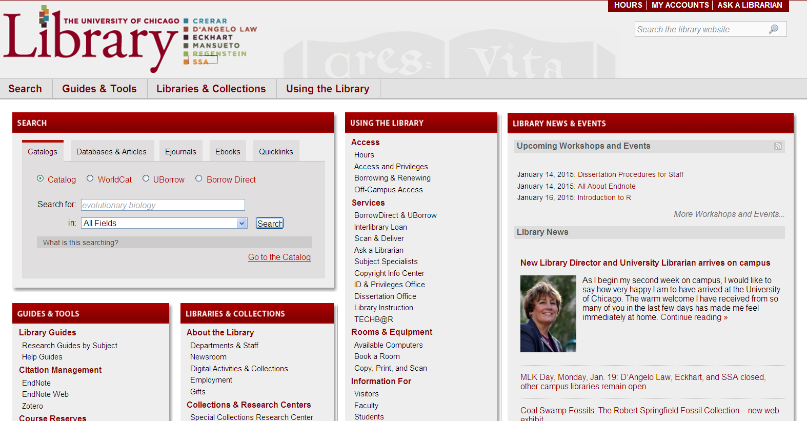
The design of the University of Chicago’s library website is also blah. The site fails to inspire because—like the library—it doesn’t actively promote its collections. It lacks soul.

A new romantic spirit in the library is to focus not on the delivery of information, but on facilitating the type of intellectual experience your user will experience in the library. It strives to create an immersive environment which is rich, stimulating and promotes discovery. It is the exact opposite of “the dome,” where there are no visible human works and no ability to browse. This is not a library, but a warehouse.
Basic Ingredients of a Library Home Page
All or most library home pages contain the following:
- header area which contains, hopefully, the library’s logo (and not the university’s) justified left, and ideally some other useful element off to the right so that space is not wasted.
- navigation menu to access pages in the site
- hours of operation, sometimes with a calendar
- a search box, either tabbed or “Big Search” (single search)
- links to other library services and resources
Optional features:
- Ask a Librarian feature (anything from an email link to rather large chat box)
- a slider (at least one) to promote featured resources, events, make announcements or add interest to the page, and/or
- new books area, sometimes featuring thumbnails of book covers and links to new titles
- frequently used or recommended resources section
- a-z subject guides
- area for library news and events
My design principles:
- Put content where users will see it. Realize that anything “below the fold” will be invisible to most of your users who aren’t going to bother to scroll down just to see what they’re missing.
- Use the website to promote things of interest to your users. You don’t promote the library by talking about “the library.” You promote the library by marketing your content and your collections.
- Use your website to create a sense of place. Have the design elements used on your site reflect in some way or “reiterate” the beauty spots of your library, even if just an accent.
- Use a complex palette of 5 complementary colors. Use color to divide different areas of your site, to add interest and to minimize clutter.
- Remember that research of all kinds is a humanistic endeavor. It is not about “information” but publication. Strategize how to make your website meaningful and relevant to your constituents.
Best Academic Library Sites for 2014
Library websites fall into the category of information-driven sites, in that they are mainly about conveying information that is not inherently visual. With information-driven sites, it is often difficult to use icons and pictures in place of words in order to communicate visually with users.
Concordia University Library is not on my “best of” list, but they gave it a good try, even they apparently don’t have much to work with compared to the “most magical” libraries.
However, they get a good job because they made the most of what they have. I like the the way they clearly label their discovery tool “jump start,” sending the message that it is good for an initial dive in:
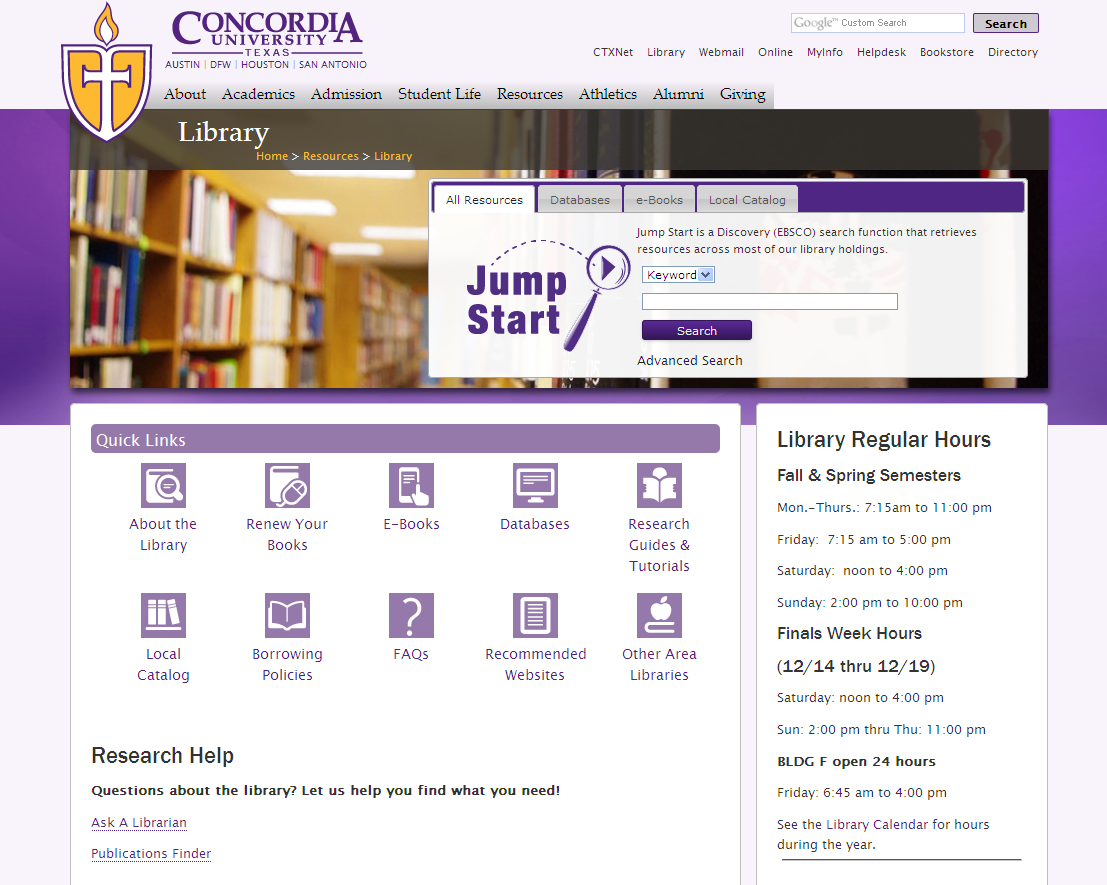
There are only so many ways to make information-driven sites aesthetically pleasing—mainly though color, fonts and graphics. The icons on their site give it more visual appeal.
Having sat down with the Directory of Higher Education, running the gamut from the largest to the most obscure libraries, from design schools to traditional liberal arts colleges, I can honestly say I have looked at least 50 websites in the last two days.
I’m not completely satisfied with my picks, but here goes and why:
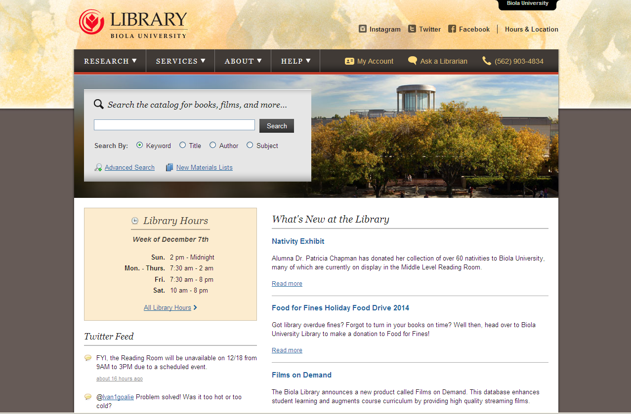
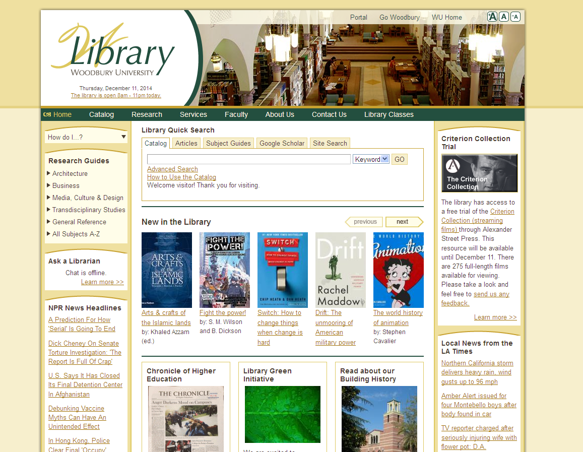
This is a nice design for a small library. The warm colors of this site and the watercolor wash at the top give it visual appeal. The page is uncluttered and relaxing, with the search box a clear focal point. The picture of the library helps establish a sense of place of serene beauty, while the traditional sarif font conveys tradition. The italics over the search box and What’s new at the library also conveys warmth and friendliness (spoken word). Events are prominent, making it easy to post announcements where they will be seen. No apps or moving parts, just a nice, well-balanced design with attractive colors and accents.

The placement of the search box on the left makes it user friendly for people on small screens, even though the site is not responsive.
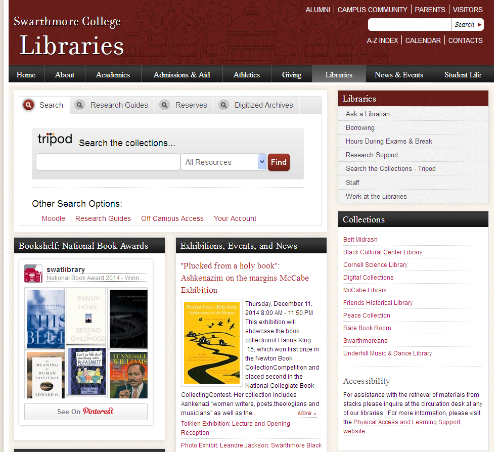
A traditional editorial style communicates book friendly, appropriate for this liberal arts college. The site set out to convey literariness and succeeds, with most of its aesthetic appeal coming from thumbnails of book covers.

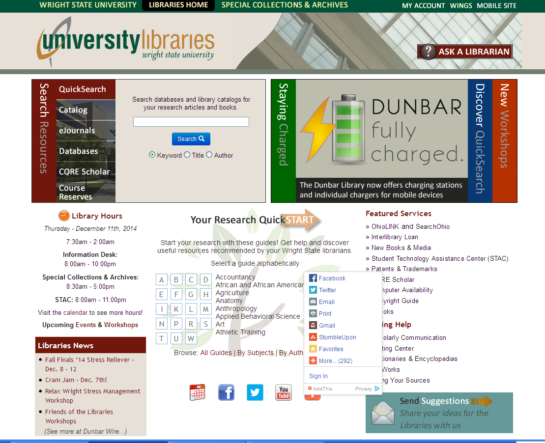
Smart use of color and sliders to put a lot of content in front of the user’s eyes. A unique look, tech-savvy and modern design with a lot of whistles and bells (click to see it in action):

They did a great job creating a sense of place and promoting their resources. The page reiterates the architectural motifs of the space. Classic and tasteful. Makes you want to go to the library. Plus you can get to the Chronicle of Higher Education from the library’s home page.

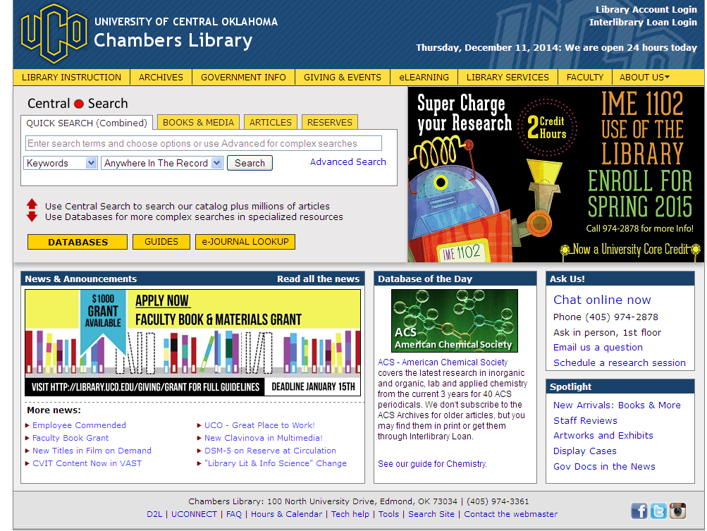
When I first saw this site I didn’t like it because it looked too much like a comic book: I didn’t like the blue and yellow (school colors). But the more I came back to it the more I liked it, and now it has become a definite fave. “Database of the day” is a nice touch. Looks as if a graphic designer is staff. There is a lot of information packed into a small amount of space, well thought out with graphics to add interest. I like the bold look.

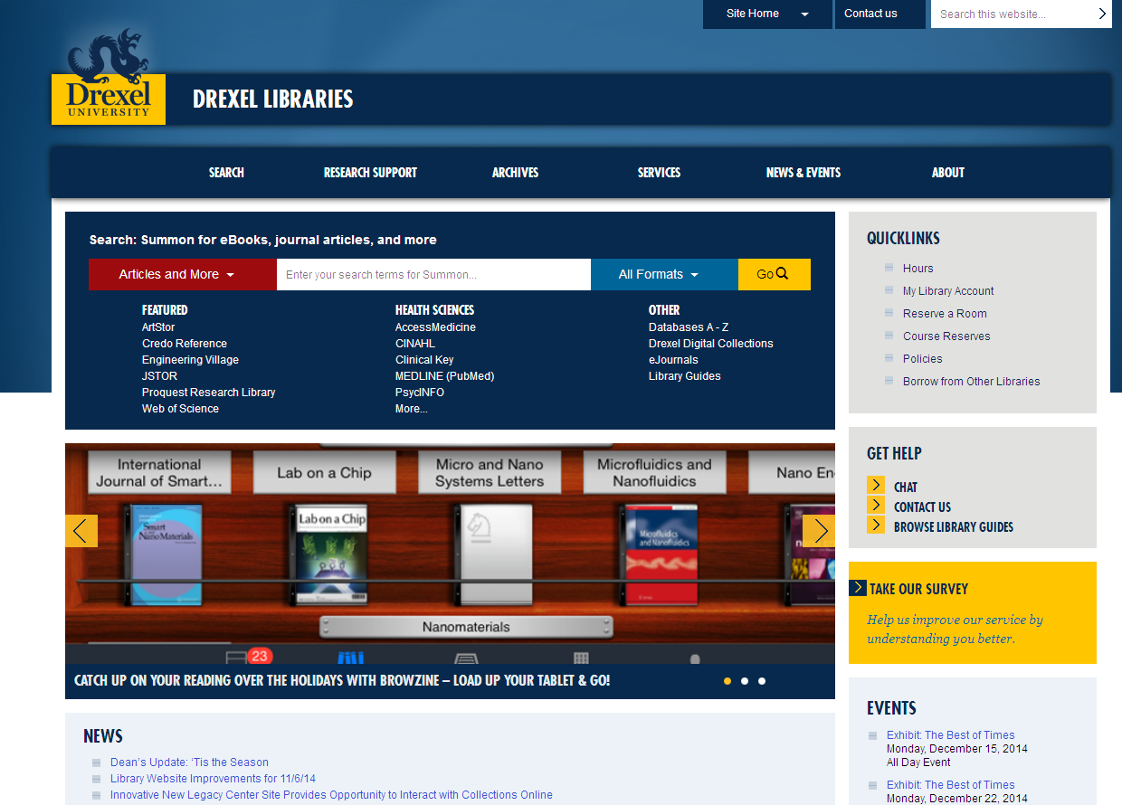
I have to admit I waffled on whether to include this one or not. I’m not sure I like it, but I like aspects of it. Boldly contrasting primary colors in responsive design framework. Love the Browzine feature.

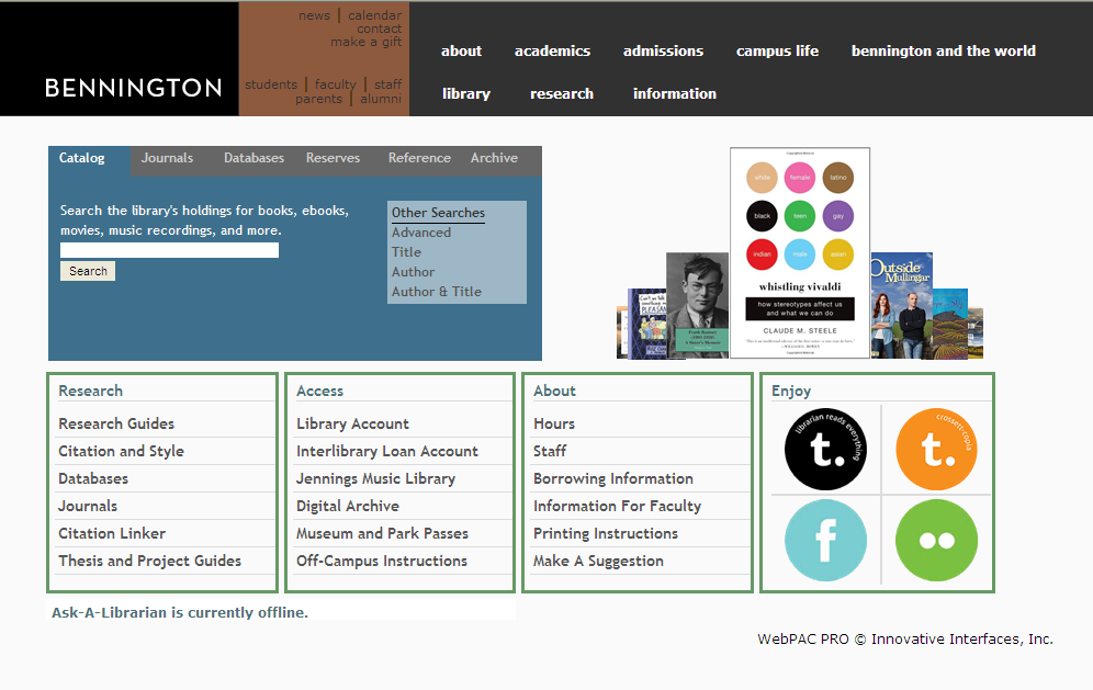
Modern design, friendly round font, clean and simple, unpretentious; I like the unusual new book scroller. Reminds me of the United Colors of Bennelton, and maybe it is supposed to?

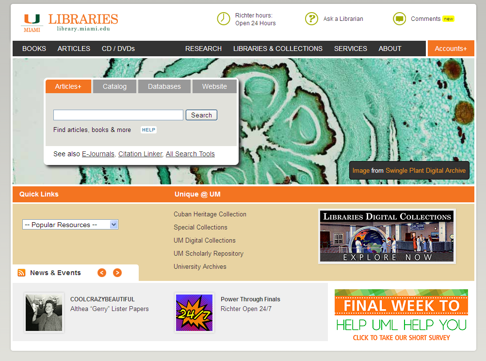
A customized WordPress template is used. Concise modern design, cool Miami colors; includes photos of the place and emphasis on collections to add interest. Like the new book slider feature at the bottom. Large image scroller and small scroller keep the site fresh.

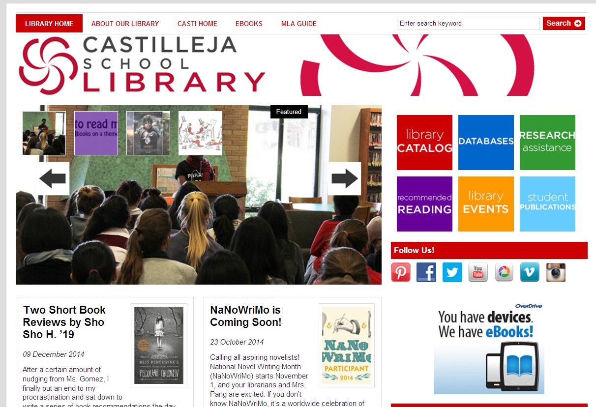
Another WordPress site; this library does an excellent job showcasing its collections and creating a festive, upbeat mood. Large colorful boxes serve as buttons, making this site easy for mobile users to navigate.

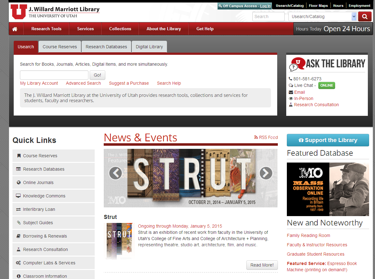
Not likely to win awards, but it is simple but effective as a community resource for the university. Like that it features events and new databases. Allows room for communication with patrons. The header is minimized, creating more room on the page to place more content where users will see it. 
Moral of the story: Give them a Reason to Come to Your Library.
As I was looking at different websites, I realized that my selection of best websites was influenced by my philosophy of librarianship, that is that college libraries should be about their collections (promoting, showcasing, adding value), and about creating a sense of community on campus—going beyond information. They are “romantic” places, in that they nurture the intellectual and spiritual nature of people.
Not only is showcasing new books and databases a good idea to help market your library, but it adds visual interest to your website. While it is typical for academic libraries to look at other academic libraries when coming up with design inspiration, public libraries might be more innovative when it comes to user engagement.
With vendors willing to provide widgetized apps to browse new books and the contents of magazines, and with so many plugin sliders and scrollers, it is easier than ever to promote awareness of resources to keep users engaged and delighted with your library.
|

