Logic Trees and Concept Maps Up through the Ages (May 2014)
Concept maps, sometimes referred to by educators as “graphic organizers,” have made a come back in education, especially in teaching critical thinking, research methods and writing skills. Feeding this revival are online tools that generate concept maps, like ThinkMap! and Credo Reference’s MindMap.
However, few people know that concept maps, logic trees and the arrangement of topoi (as they were called by philosophers during the Middle Ages), have a long history going back to the Ancient Greeks. Graphical ways to visualize and present knowledge were popular throughout the Middle Ages and Renaissance, both as a way of committing topics to memory and as a way of obtaining a deeper understanding of a particular subject.
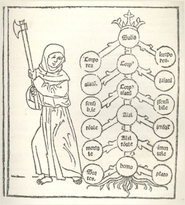
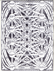
Here are just a few examples, the most recognizable being the Kabbalistic Tree of Life (a “concept map” for God’s divine attributes, image 1, and Porphyry’s Tree of Knowledge (images 2 & 3 below). The tree was a systematic approach to the organization of thought in diagrammatic form, ultimately inspired by Aristotle’s Categories. Medieval philosophers from Boethius would create these trees, often attributed to Porphyry (Arbor Porphyriana), when they wrote commentaries on Aristotle’s Categories, or on Porphyry’s Introduction to Aristotle’s Categories, but the trees took on a life of their own over time in European thought, appearing in textbooks and treatises on all subjects.
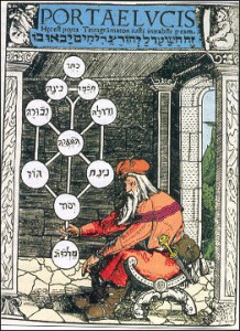  
As a librarian, cataloger, all around systems person and former medievalist, I have always had a fascination for these efforts to systematize everything and visually present knowledge. People, even Einstein, wanted assurance that creation is logical, that reality behaves in predictable ways.
During the middle ages and even today, these ER diagrams, ontologies, reflected a conviction that there is an underlying order or logic to the fabric of existence, faith in intelligent design. A good representation of the known even has predictive value. This metaphysical structure can be affirming (positivism) because it makes the world comprehensible, or dark and dehumanizing, like in the dystopian movie, The Matrix. It can reflect truth about the world, more of an ontology, or belief about the world, a taxonomy. In biology, the tree was used to trace the characteristics of animals and name species long before the theory of evolution was proposed. Sometimes the tree is presents logical categories, and other times it is just a handy way to present information visually which all relate to a topic, a construct. Scientists have to be careful not to confuse constructs with reality.
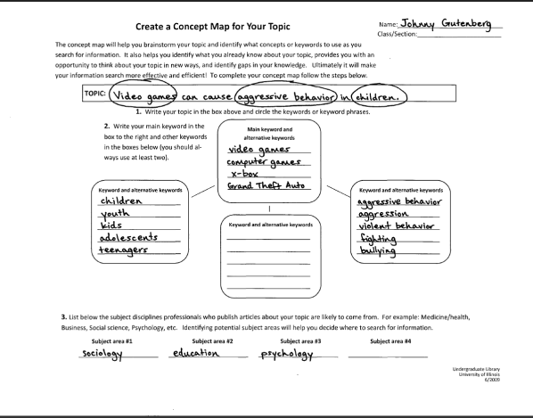
Over the last few years I have been surprised to discover that concept mapping are popular tools and approaches used in education and business today. Even in nursing and heath care, concept maps are widely employed. In the way students were at one time taught to create outlines before writing a research paper, students today are taught to create concept maps. This activity is thought to stimulate creativity, help students generate new ideas about a topic, as well as help them to organize their thoughts. Here is an example of a simple sort of concept map activity used in Information Literacy classes:
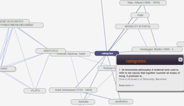
Computer applications can detect relationships among topics and present these to users in an interactive format or tree structure which can be navigated. They aren’t as beautiful as medieval or renaissance trees, but they require a lot less imagination and effort to make use of them. Like their pre-modern counterparts, they are useful for obtaining a broad overview of a topic. Here is an example of a modern concept map from Credo Reference, which the application dynamically generates based on the reference articles that are stored in its databases:
Grokker, by Groxis, was a similar type of click-and-zoom visual navigation and federated search mapping tool that was very useful both for obtaining an overview of topics and doing more in-depth research. Depending on the topic and the target databases selected, it could allow the user to potentially drill down several levels to get to articles of greater specificity. Circles represented document clusters, and documents were represented by page icons. It was based on the metadata returned from the contents of hundreds of full-text databases and online repositories. It would automatically cluster and categorically label documents returned from various sources. It was very smart, capable of disambiguation (e.g., Paris Hilton from the Hilton in Paris). Despite having its technology embedded in EBSCO and Gale’s visual search tools, the company closed suddenly in 2009. Here’s an illustration of Grokker I pulled off the web: 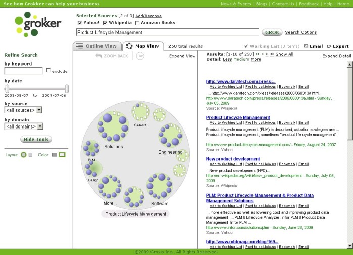 I’ve noticed that many library database vendors are now coming out with new visual search interfaces, but none of them are as good as Grokker (I was an employee at Groxis, but I can honestly say it was far better than other federated search or visual search tools for libraries, and especially in the years it flourished, from 2003-2009). At my institution, tools like Credo’s concept map help keep students engaged during a presentation (it has a big COOL factor), but, unlike Grokker, they are of limited research value for scholar in part because it reveals only the underlying structure of the Credo tool, rather than revealing any truth or insight into metaphysical reality, as the Kabbalistic Tree was supposed to do, be a divine ontology. I’ve noticed that many library database vendors are now coming out with new visual search interfaces, but none of them are as good as Grokker (I was an employee at Groxis, but I can honestly say it was far better than other federated search or visual search tools for libraries, and especially in the years it flourished, from 2003-2009). At my institution, tools like Credo’s concept map help keep students engaged during a presentation (it has a big COOL factor), but, unlike Grokker, they are of limited research value for scholar in part because it reveals only the underlying structure of the Credo tool, rather than revealing any truth or insight into metaphysical reality, as the Kabbalistic Tree was supposed to do, be a divine ontology.
I cannot help but think whenever I look at the Microsoft login screen that it is a nod to the Kabbalistic Tree of Life. Then again, maybe it’s just me.


|